Plotting Engraftment Results in React
Visualizing and analyzing engraftment results can be really tricky. Generally, we are focused on answering one question - was the engraftment successful?
In other words, does the profile post-treatment match the donor rather than the pre-treatment patient (called the host baseline). If it doesn’t match 100%, what percentage of the profile is coming from the donor, and what percentage is coming from the host baseline? Ideally, as the patient receives treatment, the host percent should decrease. This implies that they are a mix of the donor(s) from which they received treatment. To help determine this percentage, pathologists analyze samples from the donor and the patient both pre and post-treatment. The donor sample and pre-treatment patient sample will each have unique profiles, and the post-treatment sample should be a mixture of the two. The pathologist can then determine percentages based on which sample contributed the most to the post-treatment profile.
It gets tougher…
However, this gets complicated when you consider that patients may receive engraftments from many different donors over time. Each engraftment result will have components originating from the patient pre-treatment and from each of the donors. It can be difficult to identify which component on the graph came from which sample, especially if the pathologist looking at the most recent engraftment is different from the pathologist that worked on previous engraftments.
When a pathologist is brought in to analyze a set of samples (called a run), they’re greeted with a stack of prior results and notes that looks something like this:

Thankfully with the help of some modern web development frameworks and libraries, there’s a much better way. The raw data for each sample is available as
a tab-separated file, so we can parse that data and store the results for each sample. Then, on our web application, we use the fantastic react-vis library from Uber
and Facebook’s excellent fixed-data-table to build an interactive plot that eliminates a lot of headaches for our team.
Data Stores
Here’s what the store looks like:
class EngraftmentPeakStore extends ReduceStore<string, EngPeak> {
  getInitialState(): State {
    return Immutable.OrderedMap();
  }

  reduce (state: State, action: Action): State {
    switch (action.type) {
      default:
        return state;
      case 'receive-all-peaks':
        return addAllPeaks(state, action.peaks);
      case 'calculation/update-annotation':
        return state.setIn([action.peak_id, 'annotation'], action.annotation);

    }
  }

}
For each engraftment result we have a set of peaks with size (x-axis) and height (y-axis). The peaks are numbered P1, P2, P3, etc. and stored according to that unique identifier. In our
application we keep track of all the peaks in an Immutable.OrderedMap, where the peak id points to an EngPeak object.
The EngPeak object contains the size, height, and annotation of the peak. Annotation is particularly important here, as it’s the only thing about the peak that’s editable by the user. We want the pathologists to be able to annotate each peak - recording whether the peak can be attributed to the pre-treatment patient sample or the donor sample. In our data table and graph implementation, we’ll have the component dispatch a change event each time an annotation is modified. That dispatch is processed here in the store - using the setIn function of Immutable.OrderedMap.
Creating the Table
Now that we have the data store, we pass the peaks as props through our container into the Data Table component:
class PeaksDataTable extends React.Component {
  constructor(props) {
    super(props);
  }

  handleAnnotationEdit(peak_id, e) {
    dispatch({type: 'calculation/update-annotation',
      peak_id: peak_id,
      annotation: e.target.value });
  }

  render() {
    var dataList = this.props.peaks;
    var width = this.props.containerWidth;
    return (
      <Table
        rowHeight={50}
        headerHeight={50}
        rowsCount={dataList.length}
        width={width}
        height={400}
        {...this.props}>
        <Column
          header={<Cell>Peak</Cell>}
          cell={<TextCell data={dataList} col="peak_id" />}
          fixed={true}
          width={width/6} />
        <Column
          header={<Cell>Size</Cell>}
          cell={<TextCell data={dataList} col="peak_size" />}
          width={width/4} />
        <Column
          header={<Cell>Height</Cell>}
          cell={<TextCell data={dataList} col="height" />}
          width={width/4} />
        <Column
          header={<Cell>Annotation</Cell>}
          cell={<EditableCell
            data={dataList}
            col="annotation"
            handleEdit={this.handleAnnotationEdit}/>}
          width={width/3} />
      </Table>
    );
  }
}
To render this data table, we use Facebook’s fixed-data-table. Each Column takes a header and a cell as props. For our headers, we only need basic text so we simply use the default Cell component included in fixed-data-table. For our actual rows, we have an editable cell, and a non-editable cell defined below:
const TextCell = ({rowIndex, data, col, ...props}) => (
  <Cell {...props}>
    {data[rowIndex].get(col)}
  </Cell>
);

const EditableCell = ({rowIndex, data, col, ...props}) => (
  <Cell {...props}>
    <input type="text"
    style=
    value={data[rowIndex].get(col)}
    onChange={props.handleEdit.bind(this, data[rowIndex].get("peak_id"))} />
  </Cell>
);
Both cells display the value of a particular column for each row. However, the editable cell differs in that it accepts input and executes a callback whenever the value is changed. In our case, the callback handleAnnotationEdit creates a dispatch based on the new value and the id of the current row. This dispatched action is what changes our data store in the prior section. It also allows us to synchronize the annotations with the graph in real-time, as you’ll see below.
Creating the Plot
To create the plot we used a library called react-vis - for more information check out the documentation here. The peaks are provided to the plot as props, and then the render function formats and passes those peaks to the Plot as data points:
class PeaksGraph extends React.Component {
   constructor(props) {
      super(props);

      this.state = { crosshairValues: [] };

      this._onMouseLeave = this._onMouseLeave.bind(this);
      this._onNearestX = this._onNearestX.bind(this);
   }

   _onNearestX(value, { index }) {
      var newNearest = value;
      newNearest.peak = this.props.peaks[index].get("peak_id");
      newNearest.annotation = this.props.peaks[index].get("annotation");

      this.setState({ crosshairValues: [ newNearest ] });
   }

   _onMouseLeave() {
      this.setState({ crosshairValues: [] });
   }

   _createAnnotationHints() {
     var hints = this.props.peaks.map(function(peak) {
       var value = {x: peak.get("peak_size") - 1, y: 0}
       return <Hint
                value={value}
                orientation="bottomright">
                  <div style=>
                    {peak.get("annotation")}
                  </div>
              </Hint>
     });
     return hints;

   }

   //... additional helper functions

   render() {
      var data = this.props.peaks.map(function(peak) {
         var x1 = peak.get("peak_size");
         var x0 = x1 - 1;  // default the width of the bar to 1 to show the peak
         var y = peak.get("height");
         return { x0: x0, x: x1, y: y }; // format data for VerticalRectSeries
      });

      var hints = this._createAnnotationHints();

      return (
         <XYPlot margin=
            onMouseLeave={this._onMouseLeave}
            width={this.props.containerWidth}
            height={400}
            stackBy="y">
              <VerticalGridLines />
              <HorizontalGridLines />
              <XAxis orientation="top"/>
              <YAxis />
              <VerticalRectSeries onNearestX={this._onNearestX} data={data} />
              {hints}
              <Crosshair values={this.state.crosshairValues}>
                {customCrosshair}
              </Crosshair>
         </XYPlot>
      );
   }
}
To start, we want there to be a crosshair showing the nearest data point to the mouse whenever the user is hovering over the plot. The initial state is an empty array, signaling that the user hasn’t hovered over the plot yet. The _onNearestX and _onMouseLeave functions edit the state whenever the desired user action occurs. If the mouse is on the plot, _onNearestX sets the state to the nearest x value in the plot. Once the user’s mouse leaves the plot, we call _onMouseLeave and set the state to an empty array so no crosshair is shown. The crosshair data is passed to the Crosshair component, rendering an alignment line and tooltip/hint box to show the user the closest data point. The hints that are created represent the annotations of each peak from the data table described earlier. As the user changes the annotations, the changes are reflected in the data store and passed to the XY Plot.
Putting it all Together
The end result is a plot and table that looks something like this:
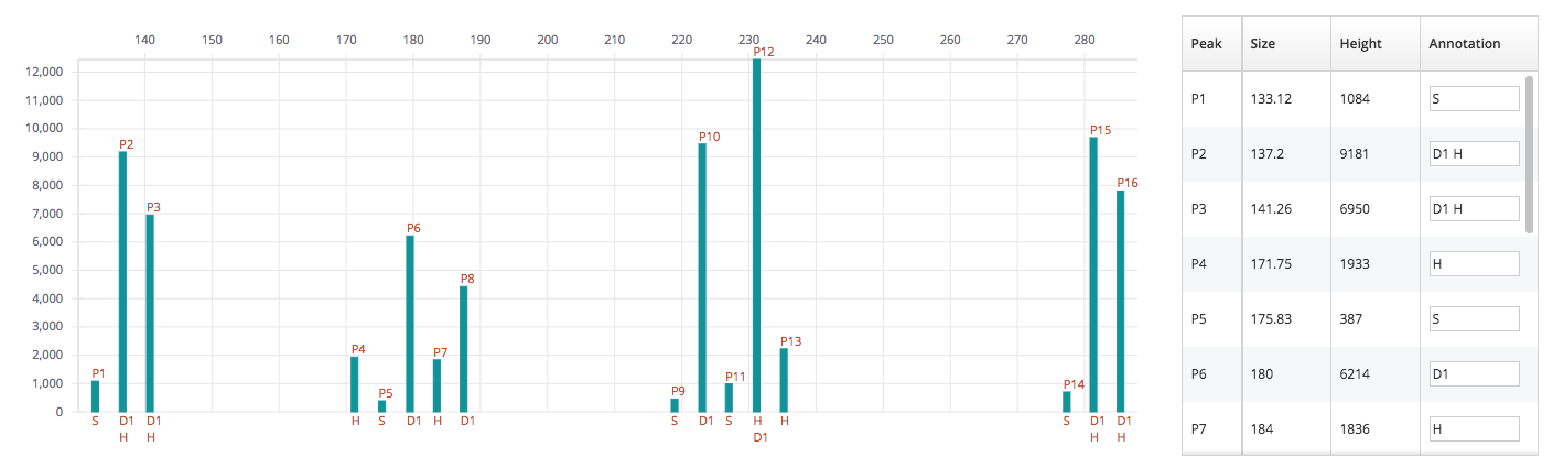
The pathologist can use these plots to quickly see what sample is contributing to the post-treatment profile of the patient, and from there make an accurate assessment of the engraftment.
Future improvements to this feature include overlaying multiple samples in one graph and adding a tracking visualization that will show the percentage of various host and donor components in the post-treatment samples.
Stay on the look out for more updates from our team as we continue to implement more interesting features!

Software Engineer